I’ve been using xlsxwriter from Python to create data graphs of data, and it is great.
I had problems with adding more data to a graph, and found some aspects of this was not documented. This blog post is to help other people who are trying to do something similar.
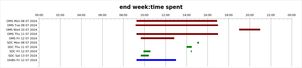
I wanted to produce a graph like
The pink colour would normally be transparent. I have coloured it to make the explanation easier.
This shows the OMS team worked from 0900 to 1600 on Monday, and SDC worked from 10am to 12am and for a few minutes on the same day around 1700. I wanted the data to be colour coded, so OMS was brown and SDC was green.
Create the workbook, and the basic chart
spreadSheet = "SPName"
workbook = xlsxwriter.Workbook(spreadSheet+"xlsx")
workbook.set_calc_mode("auto")
summary = workbook.add_worksheet("data")
hhmm  = workbook.add_format({'num_format': 'hh:mm'})
# now the basic chart
chart = self.workbook.add_chart({'type': 'bar','subtype':'stacked'})
        chart.set_title ({'name': "end week:time spent"})
        chart.set_y_axis({'reverse': True})
        chart.set_legend({'none': True})
        chart.set_x_axis({
                'time_axis':  True,
                'num_format': 'hh:mm',
                'min': 0,
                'max': 1.0,
                'major_unit': 1/12,
                'minor_tick_mark': 'inside'
                })

        chart.set_size({'width': 1070, 'height': 300})
summary.insert_chart('A1', chart)
Data layout
It took a while to understand how the data should be laid out in the table
| A | B | C | D | E | F | G | |
| 1 | OStart1 | ODur 1 | SStart 1 | SDur1 | SInt2 | SDur2 | |
| 2 | OMS Tue | 9.0 | 7.0 | ||||
| 3 | OMS Wed | 17.0 | 2.0 | ||||
| 4 | SDC Wed | 10.0 | 2.0 | 7.0 | 0.1 |
Where the data
- OSTart1 is the time based on hours for OMS
- ODur1 is the duration for OMS, so on Wed, the time was from 1700 to 1900, and interval of 2.0 hours
- SStart1 is the start time of the SDC Wed item
- SDur1 is the duration of the work. The work was from 1000 to 1200
- SInt2 is the interval from the end of the work to the start of the next work. It is not the start time. It is 1000 + interval of 2 hours + interval of 7 hours, or 1900
- SDur2 is the duration from the start of the work. It ends at 1000+ 2 hours + 7 hours + 0.1 hours
Define the data to the chart
To get the data displayed properly I used add_series to define the data.
Categories (The labels OMS Tue, OMS Wed, SDC Wed): You have to specify the same categories for all of your data. For me, range A2:A5. Using add_series for the OMS data, and add_series for the SDC data did not display the SDC data labels. This was the key to my problems.
You define the data as columns. The first column is the time from midnight. I have coloured it pink to show you. Normally this would be fill = [{‘none’ : true } ] You use
fill = [{'color': "pink"}] # fill = [{'none': True}]
chart.add_series({
                 'name': "Series1,
                 'categories': ["Hours",1,0,4,0],
                 'values':     ["Hours",1,1,4,1],
                 'fill':  fill
                })
This specifies categories row 1, column 0 to row 4, column 0, and the column of data row 1, column 1, to row 4, column 1. (Column 0 is column A etc.)
For the second column – the brown, you use
fill = [{'color': "brown"}]
chart.add_series({
                 'name': "Series2,
                 'categories': ["Hours",1,0,4,0],
                 'values':     ["Hours",1,2,4,2],
                 'fill':  fill
                })
The categories stays the same, the superset of names.
The “values” specifies the column of data row 1, column 2, to row 4, column 2.
Because the data for SDC is missing – this is not displayed.
For the SDC data I used 4 add_series request. The first one
- name:Series3
- ‘categories’: [“Hours”,1,0,4,0], the same as for OMS
- values: row 1,column 3 to row 4 column 3
I then repeated this for columns (and Series) 4,5,6
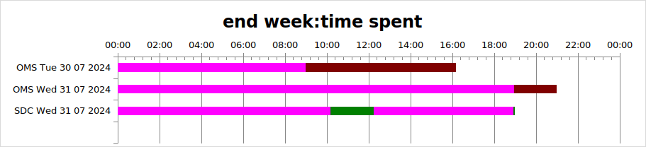
This gave me the output I wanted.
I used Python lists and used loops to generate the data, so overall the code was fairly compact. The overall result was