There are a limited set of architectural patterns for MQ. I was working with Niels Simanis on how to identify them, and how to see if they change over time. Niels suggested the application splat gave a good visualization. The data behind it could be used by machine learning to tell if the pattern changes.
What are some typical application patterns?
1. Classic front end application MQCONN.. MQPUT, MQGET, .. MQDISC
2. Classic front end application with optimised application, MQCONN, n * ( MQPUT, MQGET ).. MQDISC
3. Classic back end MQCONN n * ( MQGET, MQPUT to different queues), MQDISC
4. Sender channel, MQGET, SEND, MQGET, SEND, MQGET SEND , ( Puts and gets to SYSTEM.CHANNEL.SYCNQ)
5. Receiver channel, RECEIVE, MQPUT, RECEIVE MQPUT, ( Puts and gets to SYSTEM.CHANNEL.SYCNQ)
6. Trigger monitor MQCONN N * (MQGET with BROWSE)
Within this we can have persistent message, non persistent messages; big message and small messages.
Some poor patterns which waste resources.
1. Do no work, MQCONN, MQDISC
2. The polling application ,MQPUT, n * (MQGET wait for 10 milliseconds)
3. The careless application for every MQGET , return code buffer too small, allocate bigger buffer, MQGET
What is a splat?
From the MQ accounting data , or the application trace (on Midrange) you can extract the statistics on the various MQ verbs
1. MQCONN
2. MQPUT of persistent messages
3. MQPUT of non persistent messages
4. MQPUT1 of persistent messages
5. MQPUT1 of non persistent messages
6. Successful MQGETS of persistent messages
7. Successul MQGETS of non persisttent messages
8. Successful MQGET with browse
9. Number of gets with non zero return code
10. Number of queues used for putting. For example putting to a clustered queue
11. Number of queues used for getting
12. Big puts > n KB
13. Small puts <= n KB
14. Big gets > n KB
15. Small gets <= n KB
16. MQCTL
17. MQCB
18. MQCMIT
19. MQBACK
20. MQPUB
21. MQSUB
MQOPEN, MQCLOSE, MQINQ and MQSET could be added to the list to make it more complete.
You can take this data and create a radar or splat chart.
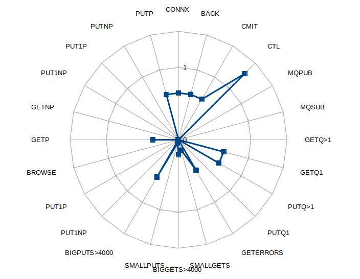
The graph looks like a paint ball has been splattered against a wall, or for the more refined, dropping a glass of red wine on a white carpet.
The data is normalized by dividing all the numbers by the sum of successful puts and gets (or 1 if there are no successful puts or gets).
What does this show us ?
We can make several observations from this chart
- It looks like there is a connect for every MQPUT – this gives scope for optimization
- Using MQPUT1 may be better than MQOPEN, MQPUT, MQCLOSE
- There is a high number of get errors. In this case every message had RC 2080 – buffer too small.
- There were puts to multiple queues. This was a clustered queue with two backends
- The size of the put message was > 4000 bytes. The returned messages a mixture of sizes. Some were > 4000 bytes, the remainder were below 4000 bytes.
With this splat graph it is easy to see if the applications are similar. For example
1. Are two business applications similar?
2. Has the shape of an application changed over time , either due to “improvements” or the workload changing.
3. You can have a “best practices profile” and see how different an application is from your the best practice profile.
Effects of application tuning
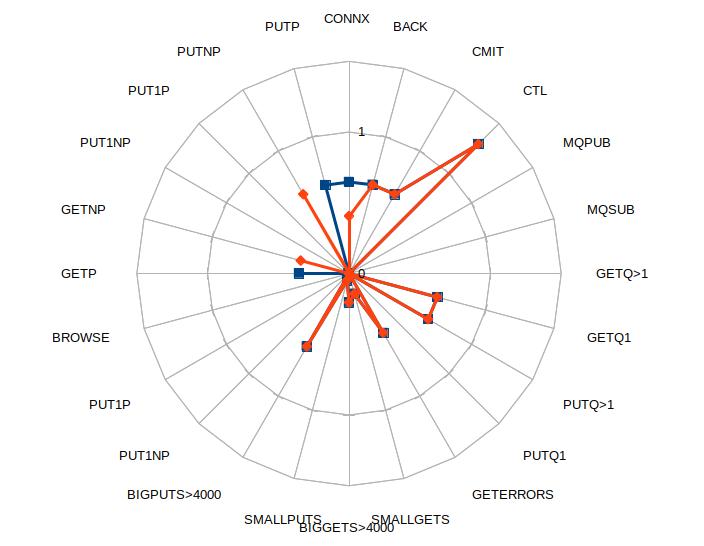
The application was tuned to use non persistent messages (as persistence was not needed) and do more work within MQCONN… MQDISC – leading to a reduction in MQCONNs.

One thought on “What shape is your application splat?”